
As an ex-rugby player, a great deal of designing the brand Portugal Rugby was to revive the values that make this sport special.
In the brand, the five shields represent Portugal and the team spirit. The elliptical shapes around the shields reflect the game dynamics.
The posters, designed to promote the game amongst youngsters in schools, used iconic images expressing the brand claim “Um ensaio para a vida”. In Portuguese, when you score a try in rugby that is named “ensaio” which also means rehearsal. Therefore the translation reads like “a rehearsal for life” which embodies the formative benefit of the sport.
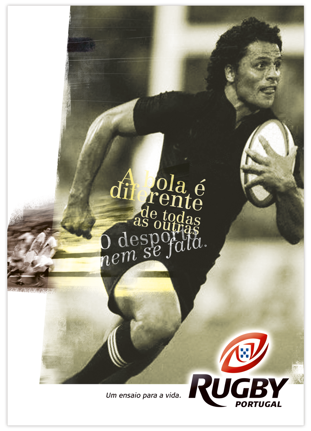
The ball is different from all the others. The sport, even more so.
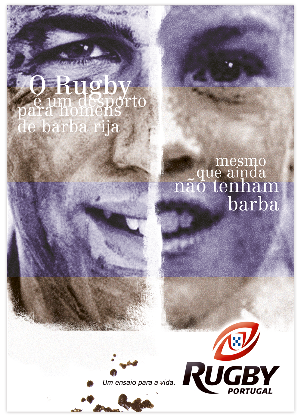
Rugby is a sport for men with a strong beard, even if they don’t have the beard yet.
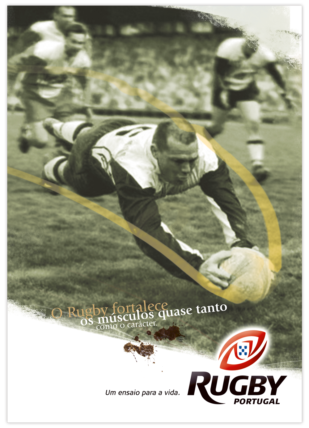
Rugby strengthens muscles almost as much as personality.
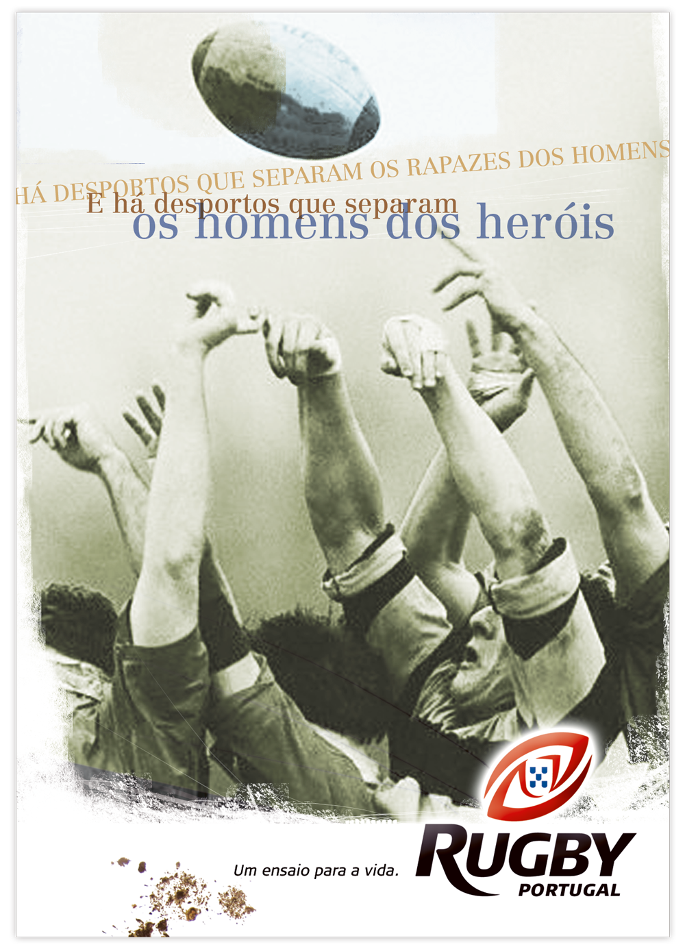
There are sports that separate boys from men. And there are those that separate men from heroes.
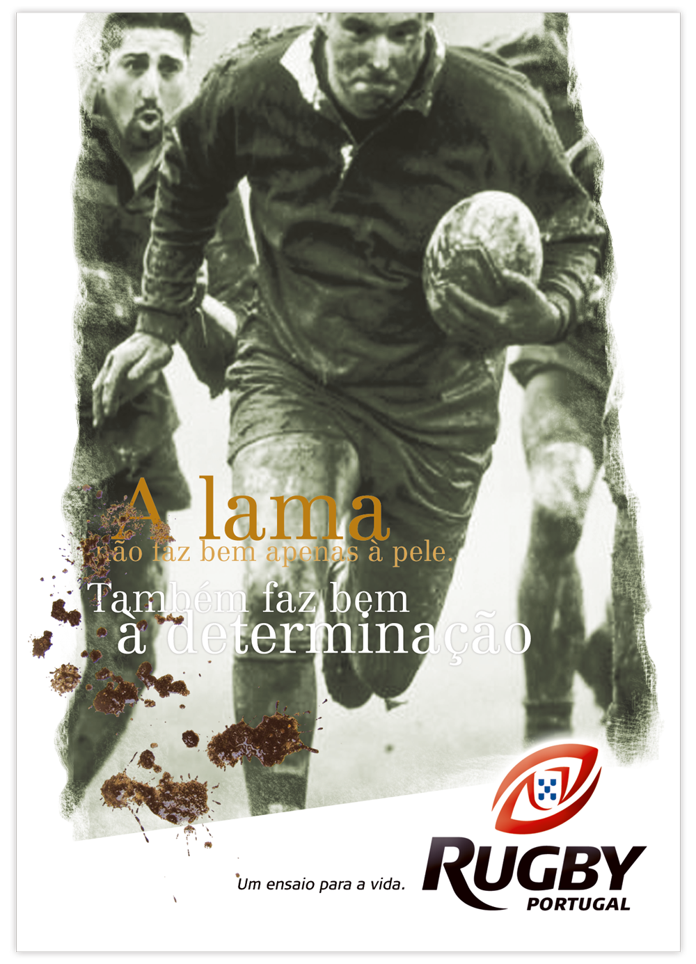
Mud is not just good for the skin. It's also good for determination.
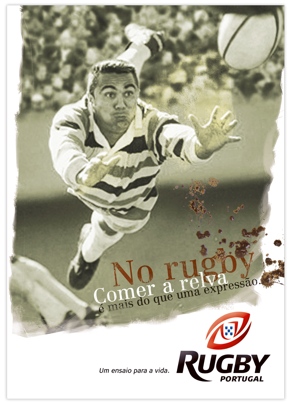
In this game, to get the jump on someone is much more than an expression.
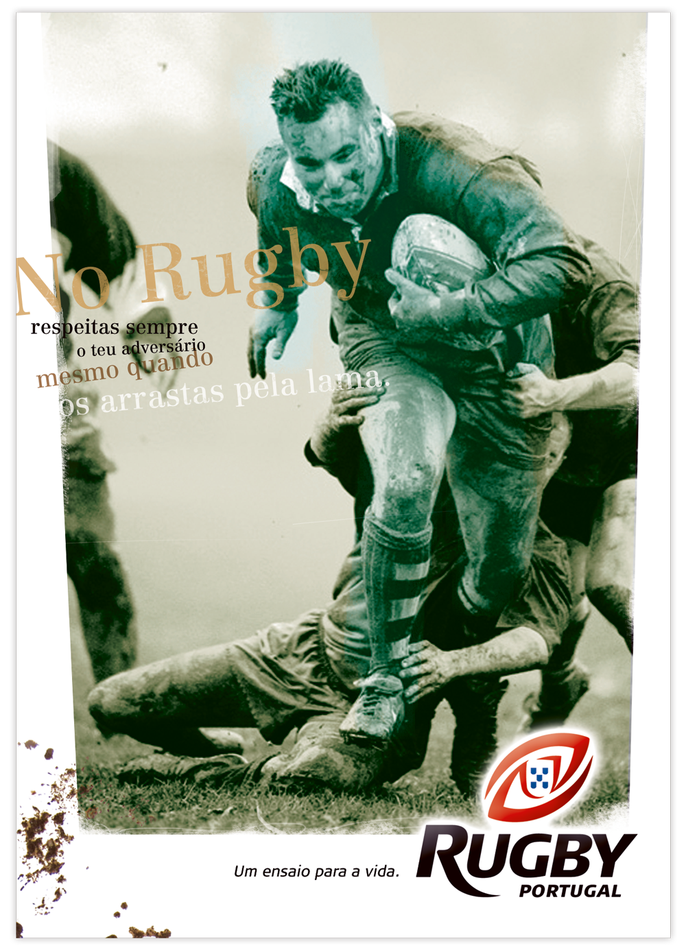
In rugby, you always respect your opponent even when you drag him through the mud.
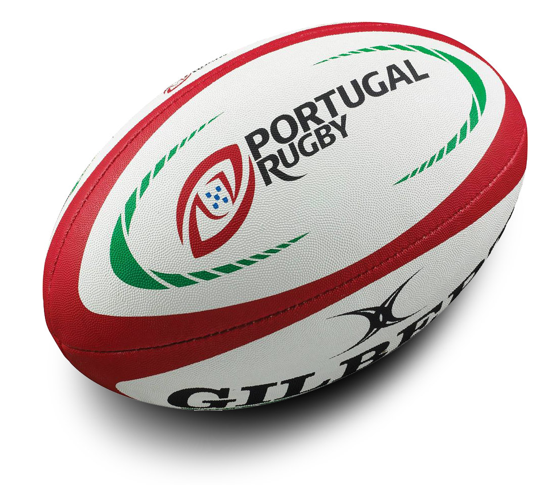
A few years later, the brand name evolved from Rugby Portugal to Portugal Rugby to further emphasize the national factor.
Agency: Lowe Portugal · Creative Director: João Pires · Copywriter: Vitor Elias · Art Director and Designer: José Soveral