Success often stems from something simple, yet rare to achieve - knowing how to give customers the best of what they need, with the treats they didn't expect to find. That's what Apolónia, the Portuguese upscale supermarket chain does.
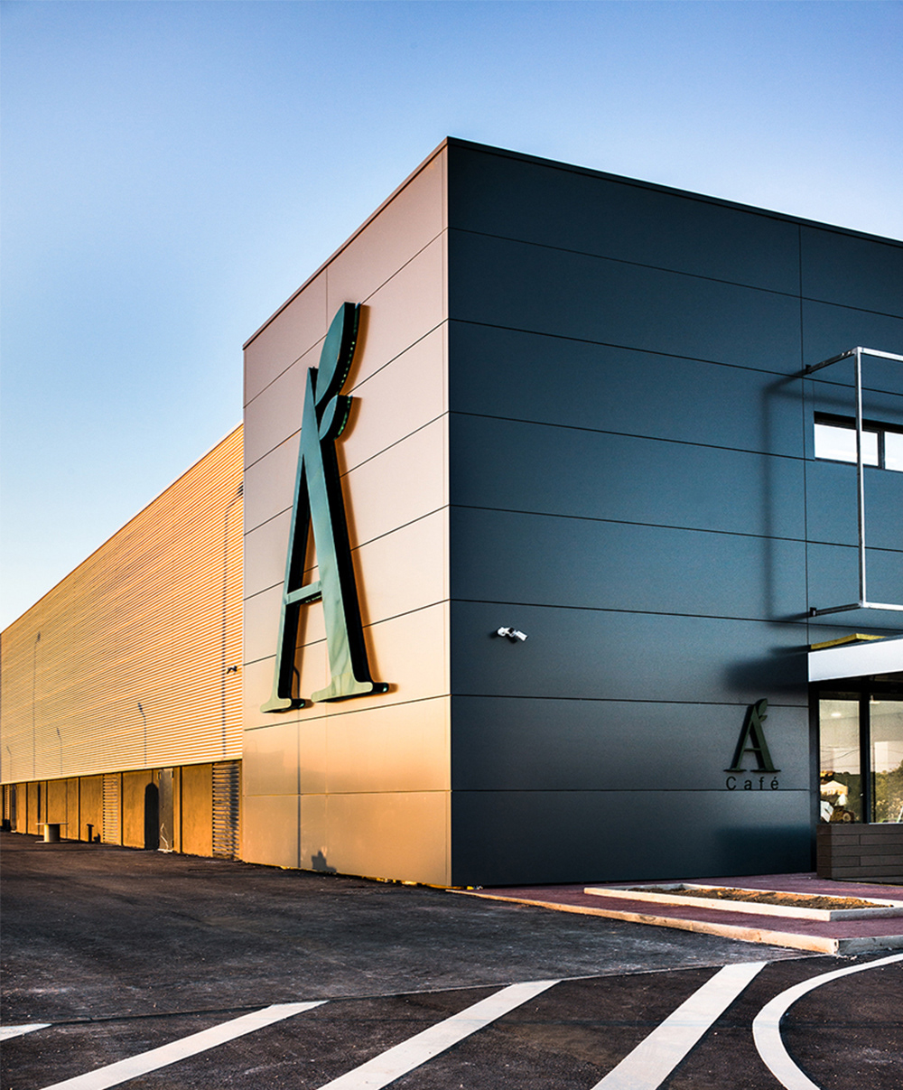
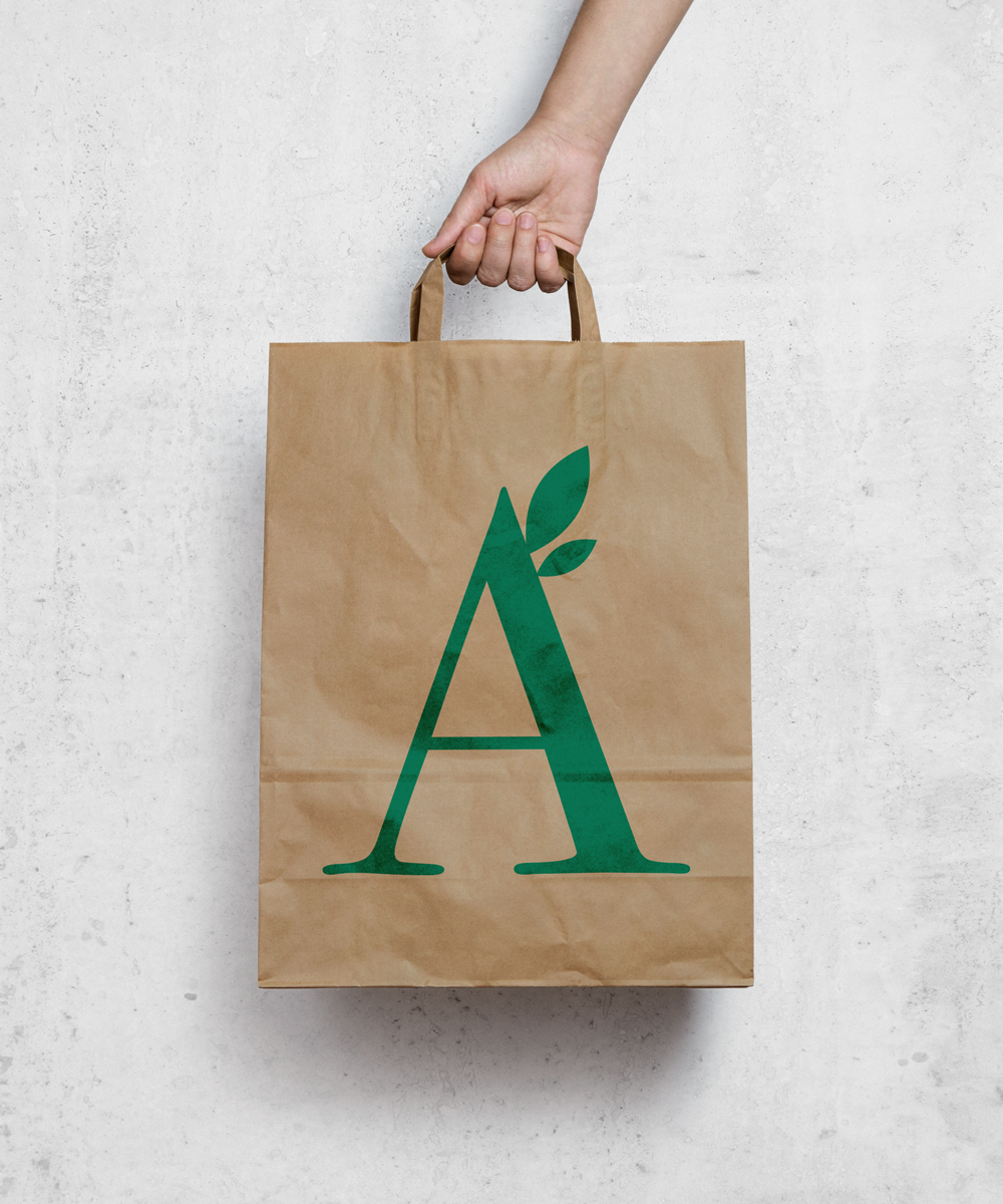
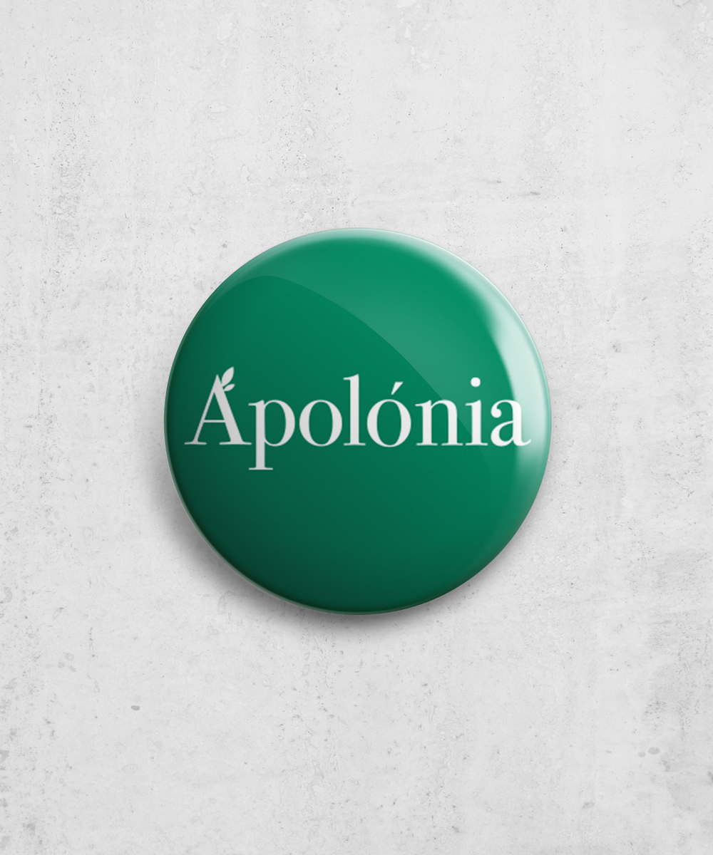
That idea was carried over to the visual identity. The symbolic "A" with two leaves expresses freshness and availability. The Bodoni font translates the sophisticated positioning of the brand.
Descrição